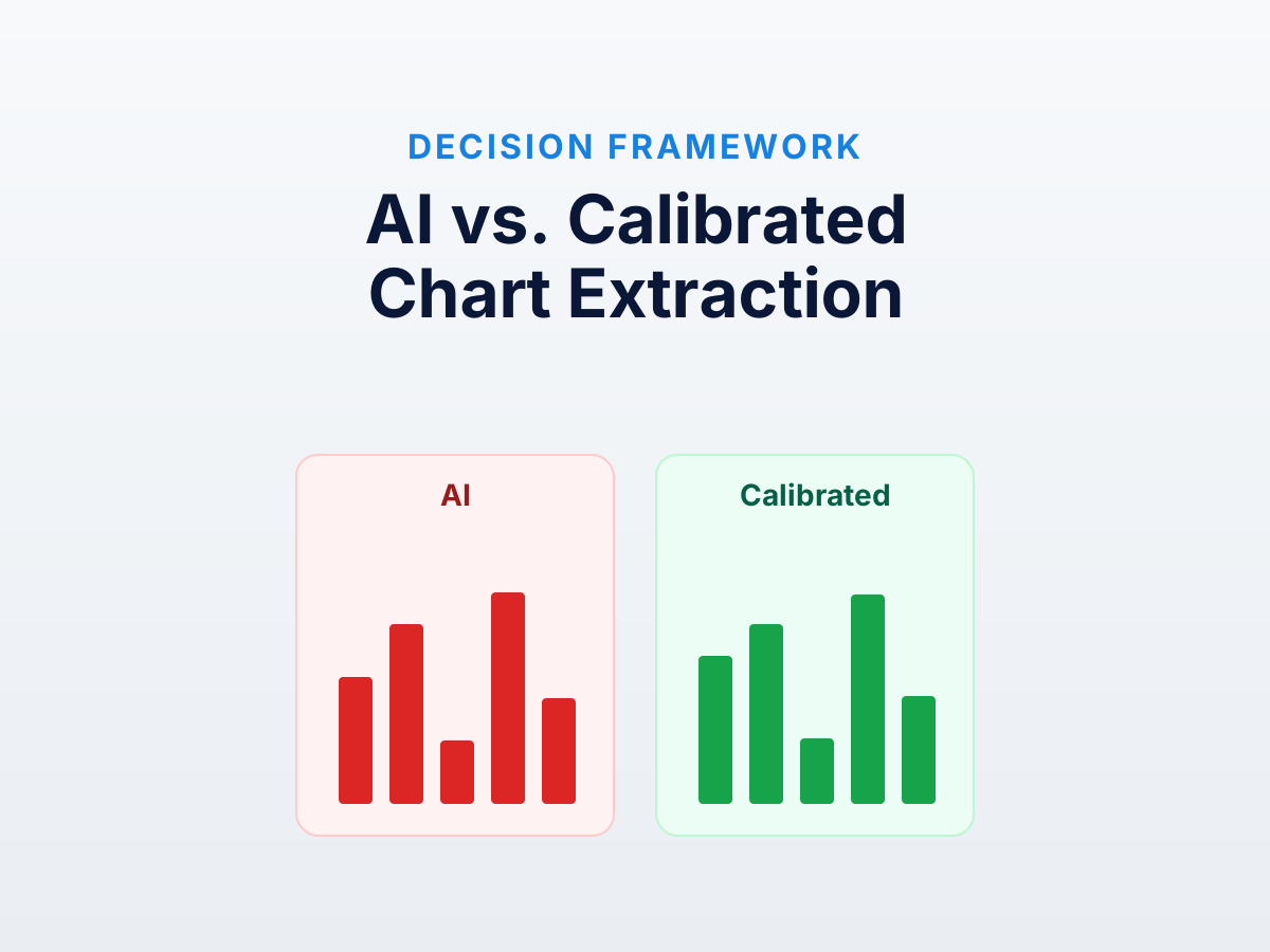
Four ways to extract data from a chart image in 2026: vision LLM (ChatGPT, Claude, Gemini), specialized model (DePlot, ChartOCR), color-based auto-extraction, or manual clicking with calibration. None dominates. The right choice depends on the chart, the precision requirement, and how much you trust each layer.
For why AI struggles, read why AI models get chart data wrong.
The four approaches
| Approach | Accuracy | Speed | Audit trail | Best chart types | Cost |
|---|---|---|---|---|---|
| Vision LLM (ChatGPT, Claude, Gemini) | Moderate to very high error | Seconds | None | Bars, simple lines | API tokens (~$0.01/chart) |
| Specialized ML (DePlot, ChartOCR) | Low to high error | Seconds | Limited | Standard published charts | GPU or HF inference |
| Color-based auto-extraction | Near-exact | Minutes | Full | Dense data with distinct colors | Free in most tools |
| Manual calibrated clicking | Near-exact | Minutes | Full | Sparse data, anything weird | Time |
The AI rows span a wide range because performance varies by chart type — frontier LLMs are at their best on bars and well off on log axes and dense scatter.
Vision LLMs
What they do. Take an image, return a structured response.
Pros. Zero setup. Conversational follow-ups. Useful qualitative descriptions when you only need rough understanding.
Cons. Accuracy is poor and silently variable. They round to nice numbers, swap series, can’t handle log axes, refuse on dense scatter. No audit trail.
Use them when. You want a one-line summary or “within 10%” is fine. A finance person Slacking a chart to ask “is revenue up or down” — perfect.
Don’t use them when. Output feeds a model, paper, regulatory submission, or further analysis. Errors are silent and accumulate.
Specialized chart-understanding models
What they do. DePlot, PlotQA-style models, ChartOCR — trained specifically to convert chart images to data tables.
Pros. Better at chart-shaped output than general LLMs. Don’t refuse on dense data, preserve series structure, sometimes free of round-number bias. Outperform general LLMs by a meaningful margin on well-formed published charts.
Cons. Rarely available as products — you run them yourself via Hugging Face (GPU, ops). Brittle on out-of-distribution input: DePlot was trained mostly on PMC figures; feed it a financial earnings chart with custom branding and accuracy drops sharply.
Use them when. Large pipeline of standard published figures and you want to automate the first pass. Validate on a sample first.
Don’t use them when. Heterogeneous input, you don’t want to run models, or you need calibration auditability. Our deep-dive covers what’s deployable.
Color-based auto-extraction
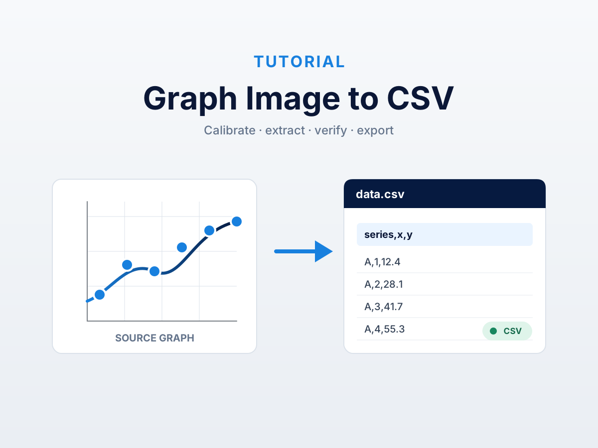
What it does. Click a color, the tool scans every pixel matching it within a tolerance and snaps a point at each. Calibrate axes with two known points each; pixels convert to data values.
This is what DataFromChart’s auto-extract does, and what WebPlotDigitizer pioneered.
Pros. Near-exact. A 200-point scatter is a 90-second job vs. an hour of clicking. Fully auditable, deterministic.
Cons. Requires distinct colors. Grayscale, heavily overlapping series, or anti-aliasing artifacts degrade extraction.
Use it when. High-density data with visually separable colors — scatter plots, dense time series, heatmaps.
Don’t use it when. Monochrome, or sparse enough that clicking beats tuning tolerance.
Manual calibrated clicking
What it does. Click each point. Set two known points per axis. The tool converts pixels to values via linear (or log) interpolation.
Pros. Works on anything visible. Accuracy depends only on clicking precision (near-exact for careful operators). Auditable, reproducible, no dependencies.
Cons. Time. A 50-point chart is 5 minutes; 250 points is impractical without auto-extract.
Use it when. Fewer than ~50 points, or auto-extract can’t handle the chart. Default fallback when accuracy must be guaranteed.
Decision tree
Follow the first branch that applies.
Deliverable for an audit, paper, regulatory submission, or downstream model? → Calibrated digitization (auto-extract if colors allow, manual otherwise).
5-bar-or-fewer categorical, “within 10%” is enough? → Vision LLM.
More than ~50 points? → Calibrated with auto-extract. LLMs refuse or fabricate. Specialized models might work; validate first.
Logarithmic y-axis? → Calibrated. Every AI approach struggles with log. See extracting data from a log chart.
Multiple overlapping series? → Calibrated with per-series color extraction. LLMs swap series.
Hundreds of similar charts and an ML pipeline already running? → Specialized models. Validate on a sample; expect 5-10% to need cleanup.
You just want to understand the chart? → Vision LLM.
The hybrid workflow nobody talks about
Best practical setup is two-stage:
- Vision LLM for understanding. Five seconds; get series names, axis units, chart type.
- Calibrated digitization for the numbers. Use that context to label axes and series, then extract deterministically.
Each tool plays to its strengths: LLM does the language task, digitizer does the measurement task. Faster than calibration alone, more accurate than AI alone.
What about “auto-extract” features in commercial tools?
Some paid digitizers (PlotDigitizer Pro, Origin/Igor plugins) label buttons “AI extract.” These combine a specialized ML model with the tool’s auto-extract infrastructure. In our testing they sit between general LLMs and calibrated extraction — better than ChatGPT, worse than careful manual work.
The discriminator is the audit trail. If the tool shows which pixels generated which values, the “AI” layer is a productivity boost on a sound foundation. If it returns numbers with no traceability, it has the same silent-failure problem as a general LLM with a nicer UI.
Cost comparison
Processing 100 charts:
| Approach | Time per chart | Total time | Per-chart cost | Total cost |
|---|---|---|---|---|
| Vision LLM | 30 sec | 50 min | $0.01–0.05 | $1–5 |
| Specialized ML | 10 sec (GPU) | 17 min | ~$0.002 | ~$0.20 |
| Color auto-extract | 90 sec | 2.5 hours | Free | Free |
| Manual click | 5 min | 8.3 hours | Free | Free |
The expensive thing in calibrated digitization is human time — and that’s also what buys correctness. If one wrong number costs $50k in rework, 8 hours is cheap. If it’s going into a Slack message, the AI cost is cheaper.
Further reading
- Specialized chart-understanding models — what’s deployable from ML research.
- WebPlotDigitizer alternatives — calibrated-digitizer roundup.
Try it on your own chart
Create a free account to upload an image or PDF, calibrate the axes, and export CSV or XLSX. Or start with a built-in sample without signing in.
Open the extractor