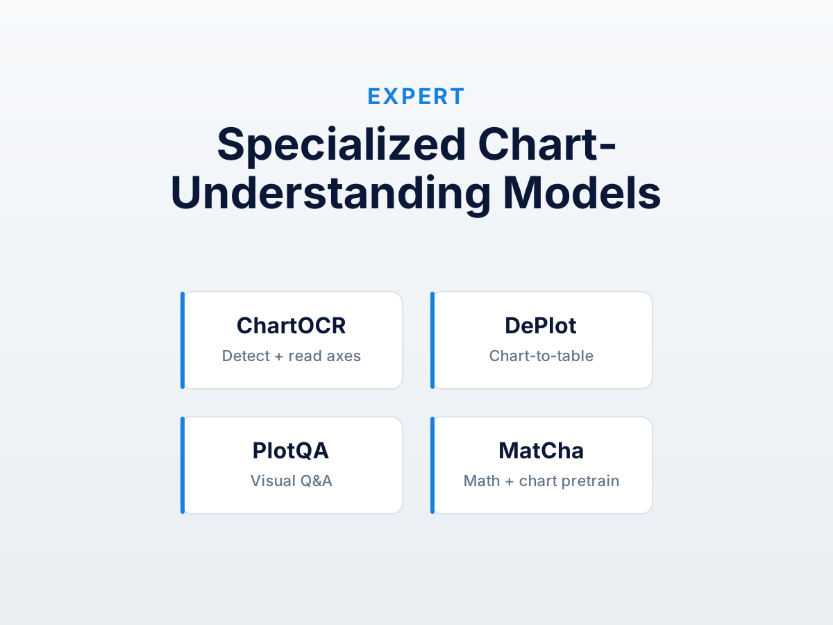
There’s a small but real research literature on chart understanding as its own ML task. The published models (DePlot, ChartOCR, PlotQA, MatCha, Pix2Struct, UniChart) outperform general vision LLMs on standard benchmarks and underperform them on real-world heterogeneous input. None is an end-user product, and the gap between “works on benchmark” and “works on your chart” is wider than the papers suggest.
If you’re building a pipeline at scale, this is the lay of the land. For a single chart, the four-step guide is faster.
Why a separate category exists
Chart-to-table is a real ML benchmark with its own datasets and leaderboards. General vision-language models trained on web-scale image-text pairs underweight chart-like images, and those in the training distribution are usually labeled with descriptions rather than structured tables. A model trained specifically on charts paired with their data can outperform a general model by 10-30 points on chart-specific tasks.
The catch: most are research artifacts (Hugging Face checkpoints, papers, occasionally a demo). Not packaged as products, training data biased toward published-paper figures, deployment usually starts with “you’ll need a GPU.”
The models
DePlot (Google, 2022)
DePlot is a Pix2Struct fine-tune that converts chart images into linearized data tables. Most-cited chart-to-table model, the one most people try first.
Output. Markdown-flavored tables — headers in row one, data after.
Good at. Standard bar and line charts from published papers. Top tier on ChartQA among open models.
Bad at. Anything visually unusual. Custom corporate styling, unusual layouts, log scales — training was heavy on academic aesthetics, accuracy drops on mismatches.
Real-world accuracy. In our testing, DePlot handled bar and line well, struggled with multi-series and Kaplan-Meier, and returned unparseable output on a log axis. 100% coverage where it worked.
How to run it. pip install transformers torch, load via Pix2StructForConditionalGeneration.from_pretrained("google/deplot"). CPU is painfully slow; production needs a GPU.
ChartOCR (Microsoft, 2021)
ChartOCR is older and broader — recognizes chart elements (axes, ticks, marks, legends) and assembles them into structured output. A pipeline more than a single model.
Good at. Identifying structure on unusual layouts. Not end-to-end vision-to-table, so more robust to weird styling.
Bad at. Pipeline architecture compounds errors — if axis detection fails, everything downstream is wrong. PMC demos are convincing; out-of-distribution is worse.
Status. Repo unmaintained as of 2024. Historical context, not a starting point.
PlotQA / FigureQA (research datasets, not products)
Not models — datasets used to train and evaluate chart-understanding models. PlotQA is larger (224k charts, 28M QA pairs), the standard benchmark for chart visual QA.
Chart QA is not chart extraction. QA evaluates whether the model answers “what is the value of bar X” with the right number; extraction evaluates whether it returns the full table. Models that score well on PlotQA aren’t necessarily good at extraction — QA lets the model use textual cues and approximate answers that wouldn’t survive strict table comparison.
Check the task before assuming an accuracy number transfers.
MatCha (Google, 2023)
MatCha is DePlot’s sibling — same Pix2Struct backbone, pretrained jointly on math reasoning and chart rendering. Forces the model to learn the relationship between rendered images and underlying numerical code, helping with arithmetic reads (log scales, percentages, growth rates).
Practical accuracy. Marginally better than DePlot on log axes — still wrong, less catastrophically. On our log decay chart MatCha at least produced parseable values where DePlot returned unparseable output. Still not usable downstream.
Where it fits. Worth trying when DePlot fails on math-heavy charts. Not a default replacement.
Pix2Struct (Google, 2022)
Pix2Struct is the foundation DePlot and MatCha build on. Generic image-to-text — not chart-specific, but good on structured visual content (web pages, screenshots, documents).
You don’t run Pix2Struct directly for chart extraction; you run a fine-tuned descendant. Most “specialized chart models” are Pix2Struct fine-tunes and inherit its quirks (preprocessing sensitivity, fixed input resolution).
UniChart (Salesforce, 2023)
UniChart is a more recent multi-task entrant — chart QA, summarization, and extraction from one model. Extraction is comparable to DePlot on standard benchmarks.
What’s interesting. Multi-task training is meant to generalize better. We haven’t seen this dramatically pay off out of distribution, but the architecture is closest to “product-ready” — Salesforce maintains it actively and the inference code is cleaner.
Performance vs. real charts
Every model here was evaluated primarily on ChartQA, PlotQA, or derivatives. Those benchmarks are dominated by PMC figures — uniform styling, standard types, predictable layouts. Published accuracy reflects that.
Run the same models on:
- A Bloomberg-style financial chart with custom branding
- A slide-deck chart
- A dashboard screenshot
- A photograph of a chart in a printed report
…accuracy drops by 20% to “completely unusable.” Training data didn’t cover these.
This is the headline difference between specialized models and general vision LLMs like Claude or GPT-4o. General LLMs are worse on PMC-like figures but more robust across heterogeneous input. If inputs look like training data, specialized wins. If heterogeneous, murkier.
Why none of them are end-user products
Six things you’d need to ship a specialized chart-extraction model:
- Inference infrastructure. A model that runs in 10 seconds on a GPU runs in 90 on CPU. Users won’t wait; you need hosted GPU inference with its own ops cost.
- Output normalization. Models return markdown tables, JSON, or semi-structured strings. Each needs a parser, brittle on edges.
- Axis calibration UX. When the model gets 80% right, you need a UI for the user to fix 20%. That UI is a digitizer’s manual mode — at which point you’ve built a digitizer.
- Error confidence. No per-value confidence. Every extraction needs full review.
- Heterogeneous-input handling. Gap between “works on test set” and “works on your user’s chart” is wide. A product can’t ship 50% accuracy.
- Maintenance. Research artifacts go stale. A product needs an active model lifecycle.
Tools like DataFromChart sidestep all six by putting the user in the loop for measurement, with deterministic calibration handling the math. ML wins eventually if these get solved — but in 2026, calibrated ships.
When specialized models actually help
Two shapes pay off:
High-volume processing of standard published figures. Thousands of PMC papers for a meta-analysis — DePlot’s first pass with human review on the 20% it gets wrong is faster than fully manual. This is the meta-analysis workflow where volume justifies the engineering.
Bootstrapping ground truth for a custom model. Training your own extractor on a domain corpus — off-the-shelf gives a starting point. Fine-tune from a DePlot checkpoint, replace training data, accept incremental improvement.
For everything else — single charts, heterogeneous input, accuracy over throughput — a calibrated digitizer is the right tool.
Further reading
- AI chart extraction vs calibrated digitization — decision framework covering when to consider these models versus skipping straight to manual.
- Why AI models get chart data wrong — the architectural argument applies to specialized models with different emphasis.
- Data extraction for meta-analysis — the highest-volume use case where specialized models can be worth the investment.
Try it on your own chart
Create a free account to upload an image or PDF, calibrate the axes, and export CSV or XLSX. Or start with a built-in sample without signing in.
Open the extractor