

Workshop three of five. You’ve done a bar chart and a multi-series line by clicking points. Here’s where clicking stops scaling — 250 points across three clusters — and the color-based auto-extraction that handles it in 90 seconds.
The practice chart
Open this chart in DataFromChart →
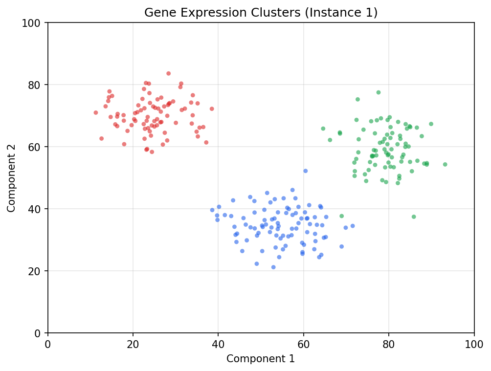
Three distinct clusters: red top-left (~80 points), blue center-bottom (~90), green right (~80). Both axes 0-100, no log, distinct colors with light alpha blending.
Target: all 250 points, separated by cluster.
Why clicking won’t work here
Manual clicking takes 2-3 seconds per point. 250 × 2.5s = 10 minutes, and you’ll lose track of which dots you’ve already hit.
It’s also where AI extraction reliably fails. ChatGPT and Claude refuse on dense scatters and return only a handful of “representative” points; Gemini covers a fraction.
Color-based auto-extraction bridges the gap: sub-1% accuracy, full coverage, 90 seconds.
How color-based extraction works
Pick a color. The tool scans every pixel, snaps a point at every pixel cluster matching within a tolerance you set, and returns a series. Repeat per cluster.
Near-deterministic — no model in the loop. The only variable is tolerance, with a slider and visual preview.
Step 1: classify and calibrate first (PREPARE → AXES)
Open the chart and click Next to PREPARE — pick the chart type (scatter), both axes numeric/linear. Then Next to AXES: both axes are 0-100, so drag the y-calibration lines to the 0 and 100 gridlines, enter the values, and repeat for x. Two pairs of clicks. Calibrate before you plot — the points you extract next inherit these axes.
Step 2: set the first series to Automated and pick its color
Click Next to POINTS. Each series has an Automated / Manual tablist — set the first series to Automated. (There’s no global “Color extract” switch; the mode lives per series.)
Click one of the red dots. The tool reads the pixel color and selects every pixel within tolerance; a preview overlay shows which matched. The default scatter algorithm is blob (connected-component detection) — leave it as is.
Bleeds into other clusters or the background? Tighten. Misses obvious red dots? Loosen.
The three clusters are well-separated in color space, so the default usually works. Adjust until red covers the red cluster cleanly with no bleed.
Step 3: extract and name
Run the extraction. The matched pixels become real points — roughly ~80 in the top-left. (Don’t expect an exact count: blob merges heavily overlapping dots into one point, so a dense cluster can come back a little short of its true N.)
Name this series “Cluster 1 - red” so the export keeps it separated.
Step 4: repeat for the other two clusters
Add a series for blue and one for green, each in Automated mode. Three rounds of color-pick → preview → extract → name, 20-30 seconds each. End: three named series, ~250 points.
Step 5: export
XLSX or CSV with cluster names preserved. Long format with cluster as a column:
cluster,x,y
red,11.27,70.94
red,12.61,62.60
...
blue,42.13,30.45
...
green,72.51,55.67
Answer key
Each cluster came from a 2D normal distribution with known parameters:
| Cluster | Mean (x, y) | Std dev (x, y) | N points |
|---|---|---|---|
| Red | (25, 70) | (6, 6) | 80 |
| Blue | (55, 35) | (8, 6) | 90 |
| Green | (80, 60) | (5, 8) | 80 |
Compute the mean (x, y) of each extracted cluster and compare. Centers should match within ±1 unit on each axis; standard deviations within ±1.
If your cluster centers are off by more than 2 units, tolerance was too loose and you grabbed pixels from neighbors. Re-run with tighter tolerance.
Common mistakes
- Tolerance too loose, picking up background. Gridlines and off-white background add thousands of phantom points along gridlines. A regular grid pattern in the preview means tighten.
- Bleeding into adjacent clusters. Alpha blending shades color edges. Red tolerance should not pick up blue, even partially. Check the preview before you run the extraction.
- Forgetting to re-pick color per series. Each series needs its own color pick in Automated mode. Reusing the last color across series gives you the same cluster more than once.
- Expecting an exact point count. Blob detection merges heavily overlapping dots, so a dense cluster can return slightly fewer points than its true N. Judge accuracy by the cluster center and spread, not the raw count.
How this compares to AI
We sent this exact chart to the major vision LLMs in our testing:
- ChatGPT (GPT-4o): refused, recommended a specialized tool.
- Claude Sonnet 4.6: refused (“too many points for reliable extraction”).
- Gemini: a fraction of the points, sparsely sampled. Centers roughly right; std devs wildly off from sparse sampling.
The calibrated workflow gives all 250 points with high accuracy in 90 seconds. Different category of result.
Dense scatter is where the comparison stops being “AI is faster but less accurate” and becomes “AI doesn’t do this.” For gene expression, particle physics, financial tick data, or weather time series — color-based auto-extraction is the workflow.
Next
- Workshop 4: Log-Scale Chart Without Arithmetic Mistakes — the chart type AI gets most catastrophically wrong.
- Workshop 5: Reconstruct a Kaplan-Meier Curve — survival analysis from a published figure.
- All five workshops + practice datasets — full hub.
Try it on your own chart
Upload an image, click your data points, calibrate the axes, and export CSV. Under three minutes, no login required for a single export.
Open the extractor

