Workshop five of five. Two-arm Kaplan-Meier survival curve — the standard chart for time-to-event data in clinical trials. Meta-analysts reconstruct these regularly when authors don’t publish patient-level data. This walks the per-arm extraction and the step-function trick AI reliably misses.
The practice chart
Open this chart in DataFromChart →
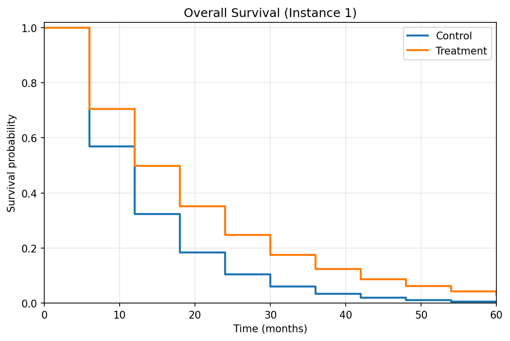
Synthetic two-arm survival curve resembling an oncology trial. Both arms start at survival 1.0 at time 0 and decay over 60 months; Control decays faster than Treatment. Step transitions at 6-month intervals.
Target: two series, each with 11 (time, survival probability) pairs.
The step-function consideration
A KM curve is a step function. Survival holds flat between events, then drops vertically at each event time. The vertical drops are the data; horizontal segments are visual continuity.
Place your point at the corner where the drop happens, not the middle of the segment. The corner is the data.
This is the most common KM digitization error. Mid-segment points look fine visually but are off by half an interval in x — and for survival analysis, where event timing drives the result, that’s serious.
Step 1: open and classify (CHART → PREPARE)
Open the chart, then click Next to PREPARE. Pick the chart type (line) and set both axes numeric/linear (time on x, survival probability on y). Advance.
Step 2: calibrate the axes (AXES)
Click Next to AXES — calibration only. Y-axis: drag calibration lines to 0 and 1.0. X-axis: drag to 0 and 60 (months). Both endpoints visible. Calibrate first; the step points you plot next inherit these axes.
Step 3: place Control arm points (POINTS)
Click Next to POINTS and create a series named “Control” (the faster-decaying arm).
Click each step corner from time 0 to 60. 11 points: 0, 6, 12, 18, 24, 30, 36, 42, 48, 54, 60.
Click the bottom-left corner of each vertical drop — the moment survival just dropped. Zoom in for late-time points where curves flatten against the x-axis and 1-pixel y errors matter more.
Step 4: place Treatment arm points
Create a “Treatment” series. 11 points at the same time intervals along the upper curve.
Step 5: export
CSV or XLSX in long format:
arm,time_months,survival
Control,0,1.000
Control,6,0.575
Control,12,0.330
...
Treatment,0,1.000
Treatment,6,0.705
...
R’s survival package and Python’s lifelines accept this directly.
Answer key
Chart generated from S(t) = exp(-h * t) with arm-specific hazard rates:
| Arm | Hazard rate | 5-year survival |
|---|---|---|
| Control | 0.0935 | ~0.4% |
| Treatment | 0.0584 | ~3.1% |
Per-point values:
| Time (months) | Control | Treatment |
|---|---|---|
| 0 | 1.000 | 1.000 |
| 6 | 0.569 | 0.706 |
| 12 | 0.324 | 0.498 |
| 18 | 0.184 | 0.351 |
| 24 | 0.105 | 0.248 |
| 30 | 0.060 | 0.175 |
| 36 | 0.034 | 0.123 |
| 42 | 0.019 | 0.087 |
| 48 | 0.011 | 0.061 |
| 54 | 0.006 | 0.043 |
| 60 | 0.004 | 0.031 |
Compute MAE per arm. Target under 0.02 (~2 percentage points). Errors of 0.05+ mean calibration drift or mid-segment points instead of step corners.
For individual-patient-data (IPD) reconstruction, feed this extraction through Guyot et al. 2012 or Liu et al. 2021 to recover number-at-risk and event times. IPDfromKM (R) does it directly. Downstream IPD accuracy is bounded by digitization accuracy.
Common mistakes
- Points in the middle of horizontal segments. Most common KM error. (time=15, survival=0.4) reads “survival was 0.4 from time 15” when the truth is “dropped to 0.4 at time 12 and held until 18.” Half-interval x error throughout.
- Missing the time-0 point. Both arms start at 1.0 by construction. Forgetting it misrepresents the initial cohort in IPD reconstruction.
- Mixing arms. Like the multi-series line workshop, arms can cross or hug each other at long follow-up. Use per-series groups and verify each arm sits on the right curve.
- Skipping number-at-risk. The row of numbers below the x-axis enables IPD reconstruction. DataFromChart reads plotted (x, y) points, not printed text — so transcribe that row into your dataset by hand alongside the extracted survival points.
How this compares to AI
Vision LLMs almost handle KM curves — they recognize the step shape and read approximate survival values — but consistently misplace step times. In our testing:
- All three frontier models were off by enough to matter on survival values.
- Step transitions landed at the wrong times in roughly half the points — usually rounded to “round” months (12, 24, 36) regardless of actual drop.
- They returned the right number of points at the wrong coordinates — coverage looked complete but the timing was off.
For survival analysis, “approximately right” doesn’t help. Hazard ratios are sensitive to event timing; misplacing events by several months moves the estimate substantially. One of the chart types where the AI vs. calibrated gap shows up most clearly downstream.
When you’re doing this for real
This chart is synthetic. Real published KM curves add:
- Censoring marks (small ticks at censoring times). Not survival drops — patients lost to follow-up. The tool extracts plotted curve points, not annotation ticks, so read the censoring times off the figure and transcribe them into your dataset by hand if your IPD reconstruction needs them.
- Confidence bands. Optional; matters if your meta-analysis pools CIs.
- Number-at-risk table below the x-axis. This is printed text, not plotted points — type its values into your dataset by hand rather than expecting the tool to read them.
- Median survival annotation. Useful for cross-checking your reconstructed median.
For the full systematic-review workflow including pooled hazard ratio estimation, see our meta-analysis data extraction guide.
You’ve finished the workshops
That’s all five. If you’ve worked through them:
- You can extract bar charts, multi-series lines, dense scatters, log axes, and step-function survival curves.
- You know which chart types AI handles and which it doesn’t.
- You have a self-graded baseline to compare future extractions against.
The full workshop hub collects everything with sortable difficulty. Drop a comment with chart types you’d like added.
Further reading
- Data extraction for meta-analysis: a practical guide — the full systematic-review workflow.
- The limits of AI chart extraction: a field guide — pillar post tying together AI’s failure modes.
Try it on your own chart
Create a free account to upload an image or PDF, calibrate the axes, and export CSV or XLSX. Or start with a built-in sample without signing in.
Open the extractor