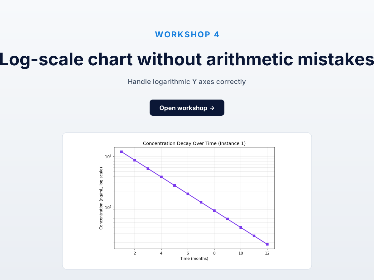
Workshop four of five. Semi-log line chart, y-axis log-scaled from 1300 to 18, with the calibration trick that turns “tricky log math” into “two clicks at visible powers of ten.” Every vision LLM gets this catastrophically wrong; calibrated extraction wins by the widest margin here.
The practice chart
Open this chart in DataFromChart →
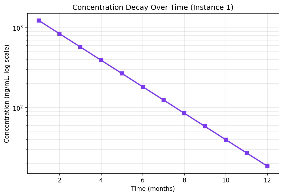
12 data points, exponential decay over 12 months. Y-axis Concentration (ng/mL) on log scale; values span ~1230 to 18. The line looks straight because exponential decay is straight on a log scale.
Target: 12 (month, concentration) pairs.
The log calibration trick
Linear calibration takes two known values and interpolates. Log is identical except you pick two powers of ten visible on the chart and tell the tool it’s a log axis.
The math the tool does:
log_position = (point_px - axis_start_px) / (axis_end_px - axis_start_px)
value = 10 ^ (log10(start_value) + log_position * (log10(end_value) - log10(start_value)))
You don’t do any of this. Just (a) mark the y-axis as log on PREPARE, and (b) calibrate at values you can see on AXES.
The right calibration points here are 100 and 1000 — both visible gridlines, both powers of ten.
Step 1: open and classify (CHART → PREPARE)
Open the chart, then click Next to PREPARE. Pick the chart type (line) and set the y-axis scale to Log₁₀ here — the log toggle lives on PREPARE, in the axis config. Critical — without it, calibration is linear and every extraction is wrong by orders of magnitude. Leave the x-axis numeric/linear.
Step 2: calibrate the axes (AXES)
Click Next to AXES — calibration only, no scale toggles here. The y-axis is already log from PREPARE, so you just mark the two values:
Drag the lower calibration line onto 10² (100) and enter 100. Drag the upper to 10³ (1000) and enter 1000.
X-axis is linear — months 1 through 12. Drag to the 2 and 10 ticks, enter 2 and 10. (Use 1 and 12 if visible; the tool extrapolates.)
Step 3: place the 12 points (POINTS)
Click Next to POINTS, then click each marker left to right. The line is straight, so points look evenly spaced — but y-values span two orders of magnitude.
Zoom in for low-value points. Months 10, 11, 12 sit near y=20-40 where gridlines compress and small click errors are big percentage errors.
Step 4: read and export (DATA)
Click DATA. Values should follow exponential decay, dropping ~1.4× per month. Export as XLSX or CSV.
Answer key
Chart generated from y = 1500 * exp(-0.385 * x), rounded to two decimals:
| Month | True concentration (ng/mL) |
|---|---|
| 1 | 1231.72 |
| 2 | 840.99 |
| 3 | 574.20 |
| 4 | 392.05 |
| 5 | 267.68 |
| 6 | 182.77 |
| 7 | 124.79 |
| 8 | 85.20 |
| 9 | 58.17 |
| 10 | 39.72 |
| 11 | 27.12 |
| 12 | 18.52 |
Compute MAE in log10 space, not linear. Linear MAE is dominated by the large early values. Log10 MAE treats a 10% error at 1230 the same as at 18 — what you want across orders of magnitude.
import math
log_mae = sum(abs(math.log10(true) - math.log10(extracted))
              for true, extracted in zip(true_values, your_values)) / 12
Target: log10 MAE under 0.02 (about 5% linear at any scale).
Common mistakes
- Forgetting to toggle “log” on PREPARE. Biggest source of error. Tool defaults to linear, giving wildly wrong values. Set the scale on PREPARE before you calibrate on AXES.
- Calibrating at non-round values. You can use any two, but non-powers of ten multiply precision error.
127and893over100and1000is valid and operationally bad. - Imprecise clicks on low-value points. Gridlines below the second-lowest power of ten are compressed. A 1-pixel error at y=20 dwarfs the same error at y=1000. Zoom in.
For the long version, see extract data from a log chart.
How this compares to AI
Worst-case chart for vision LLMs. In our testing:
- Claude Sonnet 4.6: pixel positions right, values returned as if linear. Late-month points came back well above the true values.
- GPT-4o: same failure mode.
- Gemini: same failure mode.
All three fail identically for a structural reason — see why AI gets chart data wrong. Vision LLMs read “log” as a word but don’t do 10^x arithmetic conditional on visual position. They return a linear-interpolation read of a log chart.
Calibrated extraction is sub-5% MAE in linear terms — because the math happens in the tool, not the head of a model.
Next
- Workshop 5: Reconstruct a Kaplan-Meier Curve — step functions and survival data.
- All five workshops + practice datasets — full hub.
- How to extract data from a logarithmic chart — long-form guide on log calibration.
Try it on your own chart
Create a free account to upload an image or PDF, calibrate the axes, and export CSV or XLSX. Or start with a built-in sample without signing in.
Open the extractor