Long-form reference for what we’ve learned testing AI chart extraction in 2026 — failure modes documented across our other posts, one canonical example each, plus the calibrated antidote. For a shorter take, read why AI gets chart data wrong.
The short version
Vision LLMs (ChatGPT, Claude, Gemini) and specialized chart models (DePlot, MatCha, UniChart) can describe a chart accurately but cannot reliably read its values. The gap is structural — three architectural issues — and shows up identically across every model.
A calibrated digitizer (DataFromChart, WebPlotDigitizer, or any tool in the alternatives roundup) gets sub-1% MAE where AI scores 10-40%. The trade: a 5-minute extraction instead of a 5-second API call, for auditable correctness.
The failure modes
Nine failure modes in three families: architectural (can’t see the detail), behavioral (learned shortcuts that don’t transfer), and operational (wrong tool for the task).
Architectural failures
Won’t go away with better prompting.
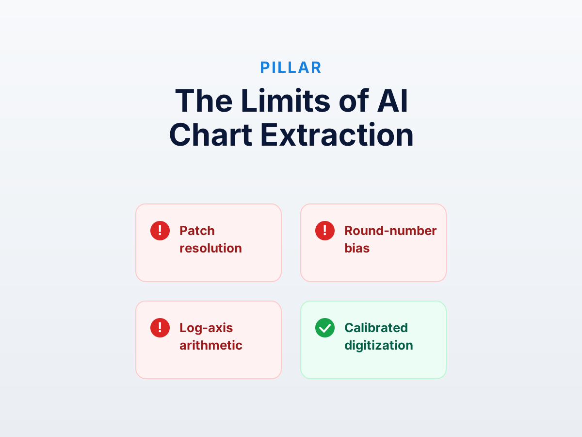
1. Patch-based image encoding loses sub-tile precision
Every production vision model splits images into 14×14-pixel patches. Tick marks, scatter points, and line crossings are smaller than the patch — the information needed to read them is averaged out before the model gets it.
Example. Ask for a point’s value, then zoom out 4× and ask again. The answer changes because the same logical position is in a different patch.
Impact. Sparse scatter is where every frontier model misses worst in our testing. Floor set by patch resolution.
Antidote. A calibrated digitizer reads pixel coordinates from the cursor — no patching, no downsampling. Sub-1% MAE; only error source is your clicking precision, sub-pixel with zoom.
2. Log-axis arithmetic is conditional on visual context
Reading a value off a log axis requires identifying the scale, reading visible ticks, estimating pixel position between them, interpolating in log space, then computing 10^that. The model can do each step in isolation; the conjunction — five steps conditional on a visual signal a few hundred tokens earlier — is unreliable.
Example. Our semi-log decay chart, values 1230 down to 18. Every frontier vision LLM we tested returned values consistent with linear interpolation of the ticks — ignoring log entirely. Late-time values came out wildly too high.
Impact. Vision LLMs are structurally wrong on log charts. Systematic — low-end wildly over-estimated.
Antidote. Toggle “log” on the y-axis, calibrate at two powers of ten, let the tool do the math. Deterministic code, not the model’s head. See the log-chart workshop.
3. Polar and other non-Cartesian axes
Vision encoders are built for Cartesian patches. Polar, ternary, and parallel-coordinate plots require coordinates that don’t align with how the image is processed.
Example. A polar radar chart with 6 axes. No vision LLM has produced usable extraction in 2026.
Antidote. Specialized digitizers (WebPlotDigitizer leads) support polar, ternary, log-log natively. Calibration UX is more complex; the math is still deterministic.
Behavioral failures
From training, not architecture. Could improve in principle; haven’t in practice.
4. Round-number bias
LLMs trained on text where humans wrote 50 more often than 49.3 pull extracted values toward 5, 10, 25, 50, 100 regardless of the data.
Example. Generate one chart with non-round values (47.3, 52.1, 49.6) and one with round (50, 50, 50). The round chart scores better — bias aligns with truth, not because the model saw it better.
Impact. Bar-chart accuracy improves noticeably moving from non-round to round ground truth — same model.
Antidote. Calibrated extraction has no model and no bias. Click where the bar top is; the tool reads what that pixel maps to.
5. Multi-series confusion
Sustained spatial reasoning — tracking three lines through a crossing — is at the edge of what these models do. They name the series from the legend but can’t reliably associate them with the right line at each x.
Example. Our 3-product line chart. All three frontier models swapped at least two series at the crossing. GPT-4o worst (5/12 months); Claude best (3/12).
Antidote. Per-series extraction. Click all of A, save, click all of B, save. Discipline keeps assignments explicit. See the multi-series workshop.
6. Soft refusal on dense data
Asked for more than ~50 points, vision LLMs refuse or return 10-15 “representative” points. Honest, but you don’t get the data.
Example. Our 250-point clustered scatter. ChatGPT and Claude refused. Gemini returned 80 points at 33% coverage.
Antidote. Color-based auto-extraction. Scans every matching pixel and snaps a point — full coverage, sub-1% MAE, 90 seconds.
7. Step-function timing errors
Kaplan-Meier and other step functions encode data in step positions, not segment heights. Vision LLMs read heights approximately but place steps at wrong times — usually rounded to nearby months or quarters.
Example. Our Kaplan-Meier workshop chart. All three frontier models placed steps at the wrong times in roughly half the points. For survival analysis where event timing drives the hazard ratio, structurally wrong.
Antidote. Per-step-corner clicking — at the time the step happens, not in the middle of the segment. See the KM workshop.
Operational failures
How AI fits into a workflow.
8. No audit trail
When a vision LLM returns a value, there’s no way to ask “which pixel?” Opaque even when right. For audit, peer review, or regulatory filing, disqualifying.
Antidote. A calibrated digitizer keeps every click traceable to a pixel, with explicit calibration. Reviewers verify by looking at the chart with points overlaid. DataFromChart’s XLSX export embeds the original chart alongside the data — visual verification without the source file. See chart screenshot to Excel.
9. Silent variability
The same chart through the same vision LLM twice produces different output. Temperature 0 helps where supported, but residual run-to-run variance remains.
Example. We ran each chart three times per model and took the median because single-call variance was real. Multi-series values shifted noticeably for the same prompt.
Antidote. Calibrated extraction is deterministic. Same clicks, same output. Only variance is your clicking precision.
How specialized models compare
The specialized models in our deep-dive — DePlot, MatCha, ChartOCR, UniChart — partially address some failures: less round-number bias, better dense data, sometimes more accurate on standard published figures.
Own problems: GPU inference, brittle on out-of-distribution input, not packaged as products. Worth the engineering only for high-volume pipelines on standardized input. For one-off extraction, more work than a calibrated digitizer.
The decision framework, restated
From AI vs calibrated digitization:
| Use case | Right tool |
|---|---|
| Slack-level “what does this chart show” | Vision LLM (ChatGPT) |
| 5-bar chart, “within 10%” precision OK | Vision LLM (Claude is most accurate) |
| Multi-series, log, polar, or dense data | Calibrated digitization |
| Output feeds a paper, model, filing, or audit | Calibrated digitization |
| 1000+ similar published figures, ML pipeline already exists | Specialized models with human-review backstop |
| One-off precise extraction | Calibrated digitization |
If you’re in any “calibrated digitization” cell, start with the four-step guide or workshop 1.
What’s actually changing
Three things to watch over the next 12-18 months:
- Multi-resolution vision encoders. Cambrian and InternVL explore “looking closer.” If this lands in production, the patch-resolution floor drops.
- Tool-use for axis arithmetic. If vision LLMs reliably invoke a calculator for coordinate transforms, the log-axis failure goes away. Doable with chain-of-thought, not automatic.
- Chart-specific fine-tuning. Big labs haven’t invested because chart extraction is a small market. If costs keep dropping, chart-specialized variants may close some of the gap.
Best guess: “usable for low-stakes questions across more chart types” in 2026, “usable for serious extraction on simple cases” in 2027, “still requires verification for anything that matters” indefinitely. The verification step is where calibrated digitizers keep living.
Index of related posts
Cluster A series in order:
- Why AI models get chart data wrong — the architectural argument.
- AI chart extraction vs calibrated digitization — decision framework.
- Specialized chart-understanding models — DePlot, MatCha, UniChart.
Workshops in difficulty order:
- Extract a simple bar chart
- Multi-series line chart
- Dense scatter with auto-extract
- Log-scale chart
- Kaplan-Meier reconstruction
Reference / hub posts:
- Learn chart digitization: 5 free practice datasets — workshop index.
- WebPlotDigitizer alternatives — when picking a calibrated tool.
Try it on your own chart
Create a free account to upload an image or PDF, calibrate the axes, and export CSV or XLSX. Or start with a built-in sample without signing in.
Open the extractor