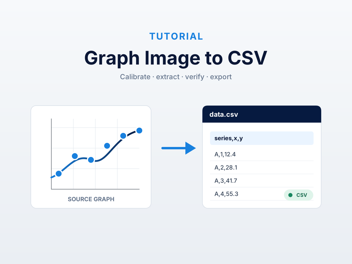
To convert a graph image to CSV, first identify the chart and axis types, calibrate the visible axes with known tick values, capture each plotted series, check the recovered points against the image, and then export the result as rows and columns.
The important step is calibration. A graph image contains pixels, not the original spreadsheet. Calibration supplies the mapping between a point’s position in the image and its numerical value. Without that mapping, a tool can read labels or estimate values, but it cannot reliably reconstruct the chart’s coordinates.
What the CSV should contain
A useful CSV preserves the structure of the chart rather than producing a loose list of numbers.
For a single-series line or scatter chart, each row normally contains an x value and a y value. A multi-series chart also needs a series column. A bar chart may use a category column instead of a numeric x value.
For example:
series,quarter,revenue
Product A,Q1,42
Product A,Q2,47
Product B,Q1,35
Product B,Q2,39
Use the labels and units printed on the chart when they are available. Quarter and Revenue (USD millions) are more useful than generic columns named x and y.
Step 1: start with the clearest graph image
Use the original PDF, SVG, PNG, or highest-resolution screenshot you can find. Keep the entire plot region, the axis ticks and labels, and the legend. Crop away unrelated page content, but do not crop off the evidence needed to interpret the chart.
Avoid repeatedly saving a chart as JPEG. Compression can blur thin lines, decimal points, minus signs, and small markers. Enlarging a blurred image may make it easier to inspect, but it does not restore missing information.
If the chart is inside a report, use the PDF chart extraction workflow. If you only have a screen capture, the chart screenshot to Excel guide explains when an XLSX file is a better audit trail than CSV.
Step 2: identify the chart and its axes
Before collecting points, record:
- the chart type: line, scatter, bar, column, or area;
- whether each axis is numeric, date-based, or categorical;
- whether a numeric axis is linear or logarithmic;
- the direction and visible range of each axis; and
- every series represented in the legend.
Do not assume that an axis starts at zero. A cropped or truncated scale can begin at any printed value. Likewise, evenly spaced labels such as 1, 10, 100, and 1,000 indicate a logarithmic scale, not a linear one.
Step 3: calibrate the coordinates
For a rectangular graph with two numeric axes, choose two known x-axis ticks and two known y-axis ticks. Place calibration references on those ticks and enter their printed values.
Choose ticks that are clear and well separated. A long calibration span reduces the effect of a small placement error. After calibration, inspect a third labelled tick that was not used: its recovered coordinate should agree with the chart.
For a linear axis, the conversion is an interpolation between two known positions. Logarithmic axes use the same positional idea in log space. Date axes map positions to dates or timestamps. The log chart guide covers that case in detail.
Categorical axes are different. The category labels themselves—such as Q1, Q2, and Q3—become the x values in the CSV, while the numerical axis still needs calibration.
Step 4: capture each series
Work through the graph one series at a time and give each series a stable name.
Manual point placement is appropriate when a chart has a small number of visible markers or bars. Colour-based extraction can help when one series has a distinct colour. AI-assisted extraction can propose the chart structure and points for supported charts, but the result still needs to be checked against the source image.
The correct point depends on the mark:
- Line chart with markers: use the centre of each marker.
- Line chart without markers: sample the visible path only at a declared x grid; the image does not reveal the chart’s original hidden rows.
- Scatter plot: use the centre of each visible marker and record that overlap may hide observations.
- Bar or column chart: capture the value-facing edge of each bar, using the calibrated zero or baseline.
- Stacked chart: measure each segment between its lower and upper boundaries rather than treating every boundary as a value from zero.
For a detailed scatter workflow, see how to extract data from a scatter plot.
Step 5: verify before exporting
Do not wait until the CSV is open in a spreadsheet to look for mistakes. Check the recovered points while they are still overlaid on the graph image.
Verify four things:
- Calibration: unused ticks map to the values printed on the axes.
- Coverage: every visible category, marker, or intended sample position is represented once.
- Identity: each row belongs to the correct series and legend label.
- Precision: the number of decimal places does not imply more certainty than the image supports.
Pay particular attention to negative signs, date formats, overlapping series, broken axes, and labels that touch a data line. If the image cannot distinguish two points, the CSV should not pretend that it can.
Step 6: export the CSV
In DataFromChart, continue to the data step after checking the plotted points, then choose CSV. The export keeps the series label and the calibrated x and y values. Axis labels become column headings when they have been supplied.
Try the complete graph-to-CSV workflow on a prepared chart. Open the sample extractor without signing in.
Open the file in a text editor or spreadsheet and make one final structural check:
- headers describe the data and include units where needed;
- dates are unambiguous;
- decimal separators are consistent;
- rows are ordered in the intended x or category order; and
- no legend label, gridline, or annotation was exported as data.
CSV, XLSX, JSON, or clipboard?
Choose the output for the next job, not just the current one.
CSV is the simplest choice for R, Python, MATLAB, databases, and most spreadsheet workflows. It is portable and easy to inspect, but it cannot embed the source graph.
XLSX is more useful when the result will be reviewed by another person. DataFromChart’s workbook export can keep the source chart with the recovered data.
JSON is useful when another application needs explicit structured fields.
Clipboard output is quickest for a small extraction that will be pasted directly into an existing workbook.
Common graph-to-CSV mistakes
Treating the graph as a table image
Spreadsheet OCR features are designed for visible cells. A plotted line encodes values through geometry, so its positions must be calibrated rather than read as table text.
Mixing series in one unlabeled column
Colour or marker shape may separate series in the image, but that distinction disappears in CSV unless each row carries a series label.
Using the edge of a thick line inconsistently
Choose a consistent centreline or marker-centre rule. Alternating between the upper and lower edge adds artificial movement to the recovered values.
Guessing hidden precision
A CSV may display many decimal places even when the graph supports only a rough reading. Keep enough precision for analysis, but document the limitations of the image and the extraction method.
Exporting before checking the overlay
A syntactically valid CSV can still contain a misplaced point, swapped series, or wrong scale. Visual verification is the last reliable chance to catch those errors in context.
FAQ
Can I convert a graph screenshot directly to CSV?
Yes, if the screenshot retains readable ticks, labels, and plotted marks. Use calibration to map the image positions to values, verify the recovered points, and then export CSV.
Can OCR convert a graph image to CSV?
OCR can help read titles, tick labels, and legends. It does not by itself recover the numerical coordinates encoded by bars, lines, or markers; those positions still need calibration and extraction.
How do I handle multiple lines?
Extract and label one line at a time. Include a series column in the CSV so rows from different lines remain distinguishable.
What if the graph has no visible data markers?
A visible curve can be sampled, but the image does not reveal the original dataset’s row locations. Declare the x positions used for sampling and treat the recovered values as derived from the rasterized path.
Can I convert a logarithmic graph to CSV?
Yes. Select logarithmic calibration for the relevant axis and enter the actual printed tick values. Verify at least one unused tick before collecting the series.
Which graph types work best?
Clear line, scatter, bar, column, and area charts with readable axes are the most direct. Dense overlap, 3D perspective, missing labels, and severe compression limit what any digitizer can recover.
Should I use CSV or Excel?
Use CSV for portable analysis and pipelines. Use XLSX when keeping the source chart beside the recovered data will make review or handoff easier.
For the broader method—including difficult scales and source-quality limits—read how to extract data from a graph image. To try the workflow immediately, open the online chart digitizer.
Try it on your own chart
Create a free account to upload an image or PDF, calibrate the axes, and export CSV or XLSX. Or start with a built-in sample without signing in.
Open the extractor